Thursday, January 26, 2012

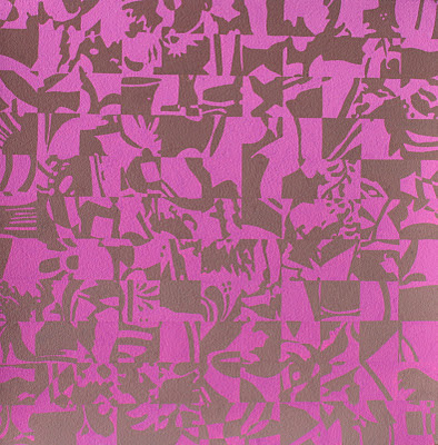
January 23, 2012 Still Life #45


Still Life #45 24 1/2"x24 1/2" gouache on oriental paper

This still life is painted on oriental paper created by Mr Hosino, master paper maker of Japan. His paper is so beautiful and he guarantees the paper for one thousand years. One thing I like about using gouache on oriental paper, is that it seems to become one with the paper, instead of just remaining on the surface. My plan was to create the graduation as before, but "necessity is the mother of invention." I have been out of white paint, sooooooo, I drew my colors, a medium green and a medium bright red. I graduated the green with a mixture of light grey yellow-green and the red with a light orange. The color seems to create mood.

Monday, January 23, 2012

January 23, 2012 Still Life #44


Still Life #44 22"x22" gouache

I am no longer choosing my favorite colors to work with, instead I am blindly choosing colors from the color box, (a box filled with color chips.) And then I am working with the color to change the hue. I chose pink and a blue for Still Life #44. I changed the pink into orange, and the blue into a blue-violet.

In the pieces before I was allowing a value change through gradation, (a slow change>0

That is one thing an artist strives for, "something happening."

Sunday, January 22, 2012

January 22, 2011 Still Life #41


Still Life #41 22"x22" gouache on w/c paper

Joseph Albers reminds us, "...as long as we hear merely single tones, we do not hear music. Hearing music depends on the recognition of the in-between of the tones, of their placing and of their spacing

Equally, a factual identification of colors within a given painting has nothing to do with a sensitive seeing nor with an understanding of the color action within the painting."

Only yellow is always warm, and only blue green is always cool, everything else is seen in relationship to other colors.

We cannot say, a blue we see in a painting is cool, it depends on what other colors are in the painting, when it is compared to the other colors, is the blue actually cool or warm?

Friday, January 13, 2012

January 13, 2011 Still Life


Still Life #37 22"x22" gouache on w/c paper

The English painter Michael Craig-Martin, who studied under Josef Albers at Yale, wrote the catalogue for London's South Bank Centre's 1994 Albers touring exhibition:

"All Alber's teaching about colour was based on the premise of its inherent instability, and hence its unpredictability. His own work had led him to realize that theoretical, systematic and intellectually based attempts to organize and determine the use of colour were doomed to fail in practice. To be able to explain colour was not to understand how to use it. How could a colour chart or colour wheel be usefully accurate, when no two printings of the same book would produce precisely the same colours, let alone those of the artwork provided to the printer? Because colour could not be grasped intellectually (or held accurately in the memory), and because every colour situation was both unstable and unique, Albers located the understanding of colour in perception and, in practice, in the quality of perception. He considered our eyes to be lazy because they were rarely subjected to exercise."

"Yes, light, there is no other word for it." --Samuel Beckett

Friday, January 6, 2012

January 6, 2012 Still Life


Still Life #33 22" x 22", gouache on w/c paper

This year I plan to continue my investigation of the idea of still life. I am also, focusing on the ideas of Joseph Alber's about color. He says, as color is almost never seen alone its visual perception is relative.


Still Life #34 22"x22", gouache on w/c paper

Color deceives continually. The same color evokes innumerable readings. Because of the interaction of color two very different colors can look alike, or nearly alike.


Still Life #35 22"x22", gouache on w/c paper

It is important to see color action as well as feel color relatedness. As we work with color we develop observation and
articulation.


Still Life #36 22"x22", gouache on w/c paper

It is through practice that we arrive at theory. We must learn to see, before we learn theory. This way of searching will lead from visual realization of the interaction between color and color to an awareness of the dependence of color with form and placement, with quantity, with quality and with pronouncement.

Not Just A Cup

  Not Just a Cup       Southern born Not a tea drinker Always coffee For me   Although I often find  Bitter taste Of the dark brew A bit muc...